You’ve probably seen by now that Proton Pass, our new password manager, was added to the Proton ecosystem. Earlier this month, Proton Pass entered public beta for Proton community members on our Lifetime and Visionary plans, and with it came a brand-new logo.
Proton Pass allows us to fulfill a longstanding demand from the Proton community, and it will enable more people to protect more of their information. We’ve shared the story behind why we built Proton Pass and how its encryption works — now we’d like to share the design story behind Proton’s newest logo.
The diamond
An often-underestimated part of product design is picking a product name and logo. While it seems like a trivial point, it can be as important to the success of a product as the technical details. With Proton Pass, we knew we wanted to keep Pass in the name to make it clear what the product does and align it with the Proton ecosystem’s naming principles.
The logo, on the other hand, took much longer and involved numerous iterations. In total, Proton’s in-house creative studio spent nearly three months researching and building concepts, focusing on what it means to be a good password manager. This led us to our final diamond concept.
A password manager must be hardened, particularly its cryptography, to protect against cyberattacks. As one of the hardest substances known to man, a diamond seemed appropriate.
Your passwords are inherently precious since they let you access your most sensitive and valuable accounts. A diamond similarly conveys this feeling of preciousness. It’s something worth protecting, just like your passwords.

The Proton Pass logo isn’t just a diamond; it also represents a keyhole. Passwords are the keys to your life, and with Proton Pass, you can not only keep your passwords safe, you can also safely access and (in the future) share them.

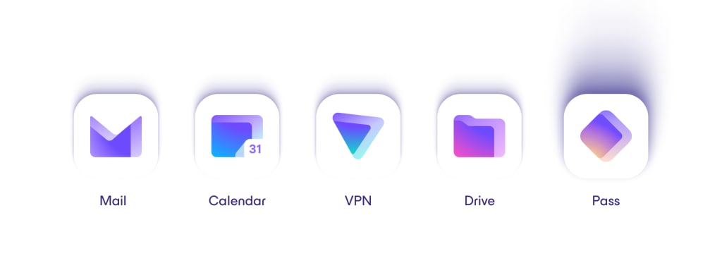
In the same way that the other Proton product logos represent a portal into a parallel universe that’s secure and private, passing through the Proton Pass keyhole takes you to a safe and private place to store your personal information, maintaining consistency with the rest of the Proton logos.
Discover the story behind Proton’s logos
A scalable design
Proton Pass is unique among Proton products in that the logo must be recognizable across multiple scales. The logo isn’t just used as a large application icon on your device’s home screen. It must also appear in small web forms, such as username and password fields.

This requires a design that can keep its integrity across a wide range of resolutions, which is a challenge because small details and features can quickly become lost as you scale the graphics down. This was another factor that led to our selection of the diamond because it works on multiple scales and remains distinct from other Proton product logos.

Color scale
Like our other product icons, Proton Pass starts with the Proton purple, a call back to the purple used in the Proton Mail beta from 2014. It then fades into a secondary yellow-orange color unique to Pass, maintaining the Proton ecosystem style. Proton Pass’s color universe references a sunset to convey the well-being, comfort, and security that we hope will accompany Proton Pass users through their journey online.

Design for the future
The Proton Pass logo has a strong family resemblance to the rest of the Proton logos. However, for long-time members of the Proton community, Proton Pass’s look and feel probably stand slightly apart. The details make it clear Pass is part of Proton, but it also doesn’t look like any other Proton app that has come before. This isn’t an accident, and we look forward to sharing why that is the case later this year.
As always, we’d love to hear your thoughts. You can join the conversation at reddit.com/r/ProtonPass(new window).


