Quando lançámos o assistente de IA(nova janela) Lumo há um ano, a nossa ambição era criar uma experiência que fosse privada, acessível e fácil de usar. Concebemos o Lumo para corresponder a estas virtudes — uma mascote de confiança e independente que protege as suas conversas pessoais.
O produto evoluiu rapidamente desde então e, com o lançamento de hoje do Lumo 2.0, está agora mais capaz, inteligente e versátil do que nunca. As conversas são mais ricas e informadas. O Lumo é mais capaz no local de trabalho. E agora tem possibilidades criativas totalmente novas graças à geração e análise de imagens.
Para a nossa equipa de design, esta evolução levantou uma questão importante: à medida que o Lumo se torna mais sofisticado, deverá o design do Lumo evoluir com ele?
O Lumo já não é um gatinho
Quando apresentámos o Lumo pela primeira vez, também apresentámos a personagem que se tornaria o rosto do produto.
Na altura, ambos eram novos. O produto estava na sua fase inicial e o Lumo foi concebido para refletir esse momento: acessível, brincalhão e acolhedor.
Ao longo dos últimos meses, expandimos as capacidades do Lumo, melhorámos a sua inteligência e aprendemos com a forma como as pessoas interagem com ele todos os dias. À medida que o produto amadureceu, pareceu natural que o Lumo amadurecesse também.
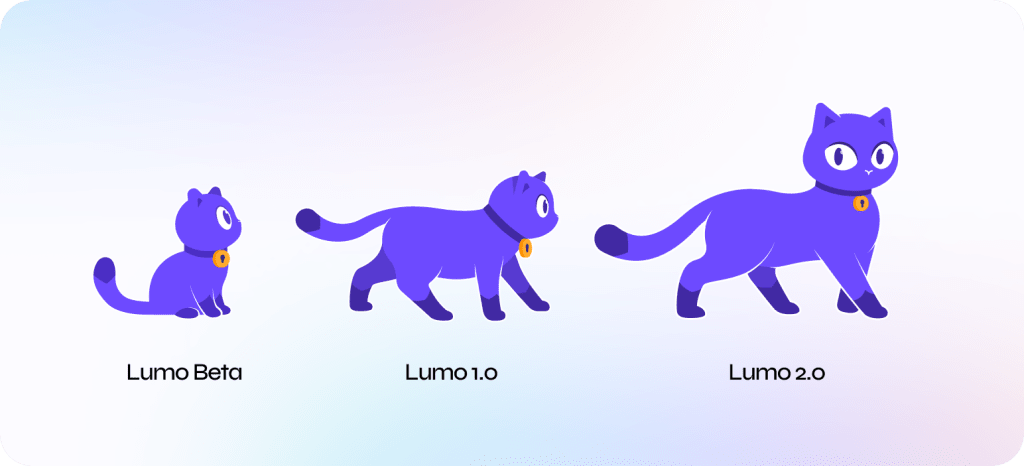
Em vez de redesenhar a personagem do zero, optámos por a evoluir. A nova versão baseia-se nos alicerces da original, ao mesmo tempo que introduz uma presença mais forte e uma maior sensação de confiança. Reflete onde o Lumo está hoje: mais capaz, mais sofisticado e pronto para o que vem a seguir.
E tal como o próprio produto, esta evolução é apenas o início.
Lumo AI
A par da evolução do próprio Lumo, também revisitámos o logótipo tipográfico, a tipografia utilizada no logótipo do Lumo.
À medida que os produtos de IA se tornam cada vez mais comuns, a clareza torna-se mais importante. Embora os membros da comunidade Proton já saibam o que é o Lumo, a maioria das pessoas depara-se com a marca pela primeira vez sem qualquer contexto.
Queríamos que o nome do produto comunicasse o seu propósito de forma mais direta, razão pela qual decidimos modificar ligeiramente o logótipo tipográfico, de Lumo para Lumo AI. É uma pequena mudança, mas que reflete melhor o papel crescente do produto no ecossistema Proton. Esta alteração aplica-se apenas ao logótipo e à identidade visual — o nome da nossa mascote favorita, claro, continua a ser Lumo.

Inspirado pela inteligência
Um dos desafios mais entusiasmantes durante este redesign foi definir como deve ser a sensação de utilizar uma interface inteligente.
Os grandes modelos de linguagem e as plataformas de IA são fundamentalmente construídos em torno de ligações. A informação move-se entre contextos, as ideias ligam-se a outras ideias e relações complexas emergem de inúmeras interações que acontecem sob a superfície.
Queríamos que a nossa linguagem visual captasse esse sentimento.
O resultado é um ambiente mais dinâmico inspirado em sistemas interligados. Ao longo do produto, movimentos subtis, profundidade em camadas e gradientes em evolução criam uma sensação de movimento que reflete a inteligência a operar por trás da interface.
Em vez de tratar o Lumo como um produto isolado, queríamos reforçar a sua ligação ao ecossistema Proton mais amplo. O novo sistema visual incorpora cores e gradientes inspirados em vários produtos Proton, criando uma maior sensação de continuidade, ao mesmo tempo que preserva uma identidade distinta para o próprio Lumo.
Refinar a experiência através do design
Para além da evolução da identidade, aproveitámos a oportunidade para revisitar muitos dos elementos fundamentais que moldam a experiência Lumo todos os dias. Embora algumas alterações sejam imediatamente visíveis, outras são intencionalmente subtis, concebidas para tornar o produto mais leve, mais intuitivo e mais agradável de utilizar ao longo do tempo.

Um ambiente mais calmo e inteligente
À medida que o Lumo evoluiu, revisitámos a forma como a cor é utilizada em todo o produto.
O roxo continua a ser uma parte importante da marca, mas queríamos aplicá-lo com maior intenção. Ao reduzir o seu domínio visual e ao introduzir uma paleta mais equilibrada, criámos uma interface que parece mais calma, mais refinada e mais fácil de utilizar por longos períodos de tempo.
O resultado é um ambiente que destaca melhor o que mais importa: a conversa, o conteúdo e o seu trabalho.

Trazer mais personalidade ao produto
O Lumo é mais do que uma interface. É também uma personagem que o acompanha enquanto faz perguntas, cria e trabalha.
Como parte deste redesign, criámos uma nova coleção de ilustrações que trazem o Lumo para diferentes áreas do produto. Estas ilustrações são mais expressivas, mais detalhadas e concebidas para reforçar a personalidade do assistente sem sobrecarregar a experiência.

Pequenas interações que recompensam a curiosidade
Alguns dos detalhes mais agradáveis no redesign são aqueles que os utilizadores descobrem por si próprios.
Ao longo do produto, o Lumo reage ocasionalmente a interações através de animações subtis e respostas lúdicas. Passar com o cursor, um clique ou um simples momento de exploração podem revelar comportamentos ocultos que dão um pouco mais de vida à experiência.
Estes momentos são intencionalmente leves, mas ajudam a transformar a interface de uma coleção de ecrãs para algo que parece mais pessoal e envolvente.
Uma galeria selecionada concebida para inspirar
Dar os primeiros passos com a geração de imagens pode, por vezes, parecer avassalador. Para ajudar a dar asas à sua criatividade, criámos uma galeria selecionada com imagens geradas pela nossa própria equipa de design utilizando o Lumo.
Estes elementos visuais mostram uma variedade de estilos, ideias e direções criativas, ajudando-o a compreender melhor as possibilidades da geração de imagens ao mesmo tempo que oferecem inspiração desde a primeira interação.

Um fluxo de trabalho criativo mais imersivo
Também pensámos na própria ferramenta de criação de imagens. Desde a geração e edição até à exploração de estilos e iteração, cada parte do fluxo de trabalho foi refinada para parecer mais intuitiva e imersiva.
O objetivo era simples: tornar mais fácil passar de uma ideia para um resultado, dando-lhe mais oportunidades para experimentar, refinar e explorar ao longo do caminho.

Olhar para o futuro
Esta atualização visual marca um marco importante no percurso do Lumo, em que a IA privada passa de uma prova de conceito para uma solução ao nível dos principais produtos de IA.
Ao longo dos últimos meses, continuámos a melhorar a inteligência por trás do Lumo, a expandir as suas capacidades e a explorar novas formas de as pessoas criarem, aprenderem e interagirem com a IA.
Mas esta evolução está longe de estar concluída.
À medida que o produto melhora para permitir um trabalho melhor, mais rápido e mais inteligente, o design continuará a evoluir a seu lado. O redesign de hoje lança as bases para as experiências, interações e ideias que ainda estão por vir.
Bónus
E porque as grandes comunidades merecem grandes ferramentas, também pensámos em si.
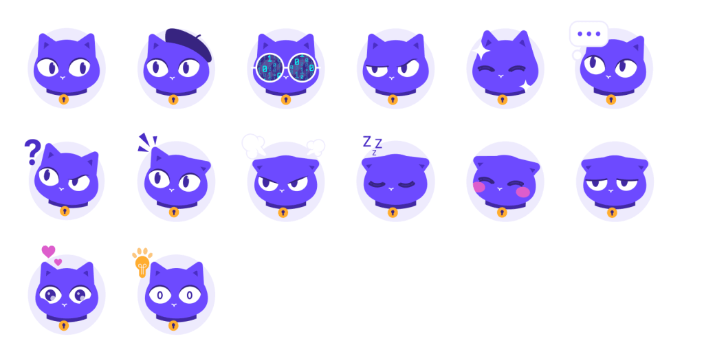
Criámos uma biblioteca de autocolantes dedicada com o nosso Lumo, pronta a utilizar nas suas plataformas favoritas, incluindo o Signal, WhatsApp, Discord e muito mais.
Está tudo disponível para transferir aqui. Esperamos que goste de os utilizar tanto quanto nós gostámos de os criar, e mal podemos esperar para os ver aparecer nas suas conversas.
Autocolantes do Signal(nova janela) Autocolantes do Telegram(nova janela) Autocolantes do WhatsApp(nova janela) Autocolantes do Slack(nova janela) Autocolantes do Discord(nova janela)