Als Proton 2014 startete, boten wir nur Proton Mail(neues Fenster) an, das zum größten Anbieter verschlüsselter E-Mails der Welt gewachsen ist. Im Laufe der Jahre haben wir jedoch immer mehr datenschutzorientierte Dienste hinzugefügt, um den Bedürfnissen der Community gerecht zu werden, beginnend mit Proton VPN(neues Fenster), dann Proton Calendar(neues Fenster) und zuletzt Proton Drive(neues Fenster). Mit der Zeit wurde aus Proton Mail einfach Proton, und unsere einzelnen Datenschutzdienste sind zu Bausteinen eines einheitlichen Datenschutz-Ökosystems geworden. Daraus ergibt sich auch die Notwendigkeit, eine einheitliche visuelle Sprache für das Proton-Universum zu entwickeln.
Das hilft, das Feedback anzugehen, das wir erhalten haben, dass den Proton-Apps eine Familienähnlichkeit fehlt.
Wir haben dies angegangen, während wir mit Protons Geschichte, Geschichte und Vision verbunden bleiben. Heute möchten wir teilen, wie sich Protons visuelles Design für die Zukunft entwickelt.
Ein neues Universum
Ein integraler Bestandteil von Protons Mission ist die Vorstellung, eine Alternative zu bieten. Proton ist mehr als eine Sammlung datenschutzorientierter Dienste. Es ist auch der Glaube, dass es einen anderen Weg gibt, eine Internetökonomie aufzubauen, die gerecht ist und für alle funktioniert. Unsere Dienste sind nicht nur ein weiteres Tech-Produkt. Sie sind ein Tor zu einem neuen, besseren Internet.
Proton repräsentiert ein paralleles Universum, in dem deine Informationen privat bleiben. Im Proton-Universum werden deine Daten an einen sicheren Ort gesendet, an dem du kontrollierst, was damit geschieht. Deine Daten bleiben immer privat und unter deiner Kontrolle.
Mit diesem Gedanken im Hinterkopf sind unsere neuen Produkticons auch Portale, durch die du zu diesem besseren Internet gelangen kannst.
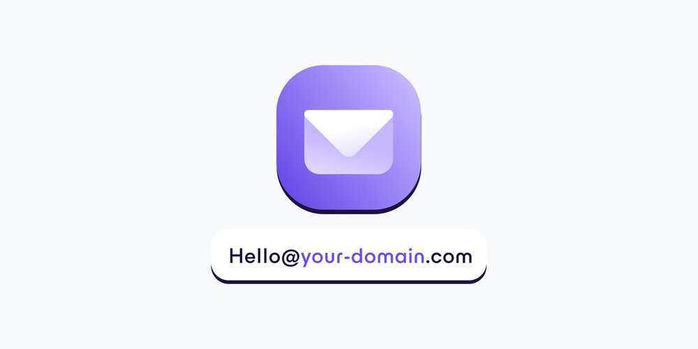
Ein wichtiger Teil, um die Proton-Produkticons zusammenzubringen, ist die Schaffung einer Familienähnlichkeit. Jedes Icon muss eine ähnliche Größe, Gewicht und Design haben, was mit unseren früheren Icons nicht möglich war. Wir haben auch einige Elemente aus unseren früheren Icons beibehalten, um eine historische Verbindung zu wahren. Das Icon von Proton VPN behält seine dreieckige Form, deren Ecken ursprünglich die drei Länder repräsentierten, in denen sich die Secure Core-Server von Proton VPN befinden, wenn man sie auf einer Karte betrachtet. Ähnlich basiert das neue Icon von Proton Mail auf der unteren Hälfte des ursprünglichen Proton Mail-Vorhängeschlosses.
Wir haben auch eine Familienähnlichkeit durch die konsequente Verwendung von Proton-Lila erreicht, das unser datenschutzorientiertes Universum repräsentiert. Historisch gesehen hatten Proton-Produkte jedoch auch ihre eigenen individuellen Merkmale. Proton VPN ist beispielsweise für seine grüne Farbe bekannt. Aus diesem Grund haben wir für jedes Produkt dezente Akzentfarben beibehalten, die widerspiegeln, dass sie auch individuelle Identitäten, Zielgruppen und Communities haben.
Ein neues Proton-Logo
Proton ist schon immer für unsere Produkte bekannt gewesen. Doch mit dem Wachstum unseres Produktangebots hat sich in unserer Community eine starke Vorstellung von „Proton“ entwickelt. Daher ist es an der Zeit, dass wir Proton selbst eine visuelle Darstellung verleihen.

Uns leitet dabei die Mission von Proton, ein besseres Internet zu bauen, in dem Datenschutz Standard ist. Proton steht für eine bessere Alternative zu den großen Technologieunternehmen. Wenn du dich für Proton entscheidest, wendest du dich von dem vorgegebenen Weg ab und gehst mutig in eine andere, bessere Richtung. Das Proton „P“ hat auch eine Tiefe und Dimensionalität, die auf die Tiefe in den Logos der Proton-Produkte anspielt.
Auch die Geschichte leitet uns, mit Verschlüsselung als Vergangenheit, Gegenwart und zukünftiges Fundament der Proton-Dienste. Das neue Proton-Symbol spielt auch auf Verschlüsselungsschlüssel an, die Teil des Fundaments all unserer Produkte sind.
Eine neue Produktbezeichnung
Zusammen mit der Einführung der neuen Symbole und Logos für Proton und unsere Produkte aktualisieren wir auch, wie wir die Namen unserer Produkte schreiben. Historisch haben wir ProtonMail geschrieben, aber mit der Erweiterung des Proton-Ökosystems um immer mehr Dienste wird es nun als Proton Mail geschrieben.
Diese Änderung ist notwendig, um Konsistenz zwischen all unseren Diensten herzustellen. Historisch wurden Proton Calendar und Proton Drive als zwei Wörter geschrieben, während ProtonMail und ProtonVPN ein Wort waren. Der Wechsel zu einer Zweiwortkonstruktion für alle unsere Produkte ermöglicht es uns, konsistent zu bleiben, während wir zukünftige Produkte einführen und passt zu unserer Entwicklung weg von einzelnen Proton-Produkten hin zu Proton als einheitlichem Datenschutz-Ökosystem. Diese Änderung spiegelt die wider, die bereits innerhalb der Proton-Community begonnen hat.
Unser Farbuniversum
Die Basisfarbe des neuen visuellen Systems von Proton ist ein neues Proton-Lila. Lila war historisch gesehen immer die Farbe von Proton. Als wir 2014 die erste Version von Proton Mail starteten, verwendeten wir ein dunkleres, gedeckteres Lila, das sich im Laufe der Jahre weiterentwickelt hat. Heute kehren wir zu unseren Wurzeln zurück, aber aktualisieren unser Lila, damit es kräftiger ist und sowohl zu hellen als auch zu dunklen Hintergründen passt.
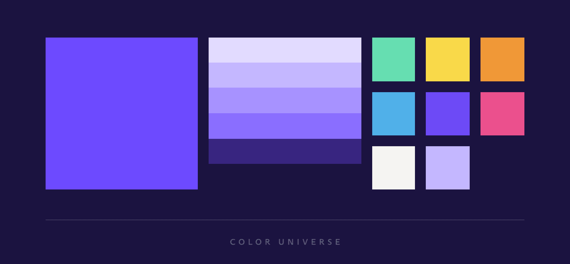
Zusätzlich zur neuen Markenfarbe und -palette haben wir spezifische Farben für jeden Dienst eingeführt: Grün für Proton VPN, Blau für Proton Calendar und Rot für Proton Drive.
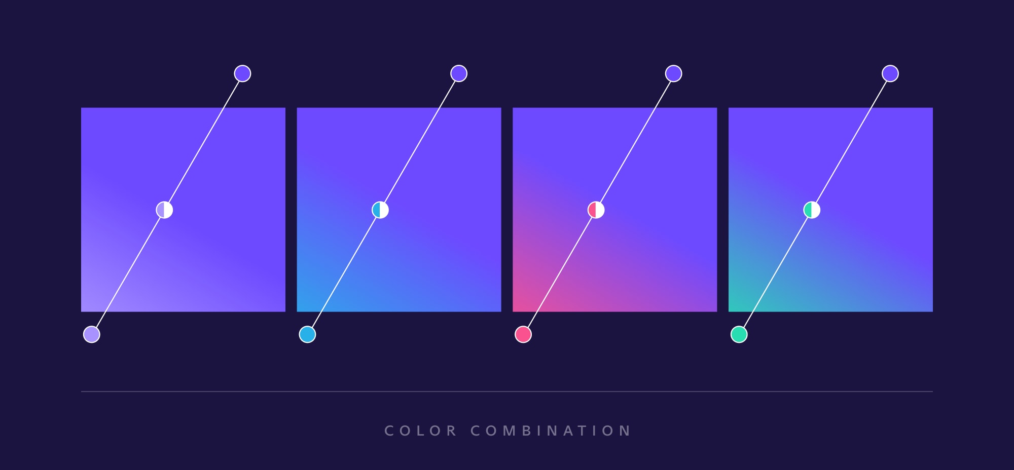
Jedes Symbol beginnt mit dem Proton-Lila und verläuft dann in die Farbe des Dienstes. Ziel hierbei ist es, einen einladenden, warmen Farbverlauf und Tiefeneffekt zu schaffen, der Menschen in das sichere, auf Datenschutz ausgerichtete Universum jedes Dienstes zieht.
Aktualisierte Typografie
Proton war schon immer ein anderer Typ von Technologieunternehmen, daher wollten wir eine Marken- und Webseitenschriftart wählen, die auch die Erwartungen der Technologiewelt übertrifft, die normalerweise fette, serifenlose Typografie bevorzugt.
Wir bauen ein Internet, das die Menschen in den Mittelpunkt stellt, daher sollte unsere Schriftart eine menschlichere Note haben. Eine Schriftart, die zum Erzählen von Geschichten verwendet werden kann, eine Schriftart mit Einfühlungsvermögen und Wärme, die widerspiegelt, wie Proton anders ist.
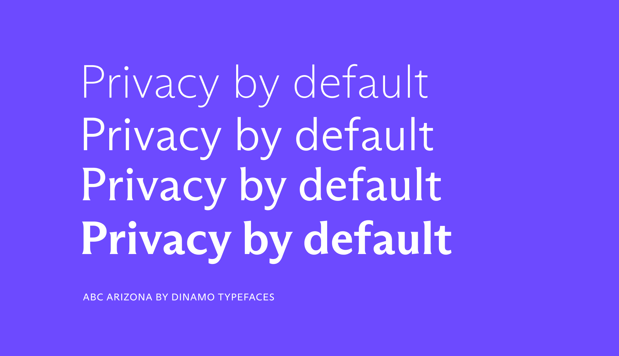
Als Schweizer Unternehmen haben wir die ABC Arizona-Schriftart gewählt, die von Elias Hanzer entworfen und von Dinamo Typefaces(neues Fenster), einer Schweizer Designagentur mit Sitz in Basel, produziert wurde. Die ABC Arizona-Typografie ist menschlich, elegant und anpassungsfähig.
Es mag ein Detail sein, aber wir glauben, dass die Wahl einer humanistischeren Schriftart signalisiert, dass wir Menschen in unserem Design, unseren Dienstleistungen und unserer Mission priorisieren.
Auf der neuen Proton-Website verwenden wir zwei Stile aus der ABC Arizona-Familie: die Sans und die Flare. Unsere Texte werden in Sans verfasst, mit seinem geradlinigen Stil und humanistischen Touch, während unsere Überschriften in Flare gesetzt werden, einer fast, aber nicht ganz serifenlosen Typografie, die eine kühnere Aussage trifft.
Eine neue visuelle Identität für ein neues Internet
Bei Proton betrachten wir unser Design als etwas Lebendiges, das sich, wie unser Ökosystem von Diensten, ständig weiterentwickeln wird. Und wie bei allem, was wir tun, wird seine Richtung von deinem Input und Feedback geleitet werden.
Die Schaffung von Protons erstem einheitlichen Designsystem ist mehr als ein einfaches visuelles Update. Es ist die Anerkennung, dass Design genauso wichtig ist wie technische Exzellenz, da die Proton-Gemeinschaft gewachsen ist. Ein ansprechendes, leicht zu bedienendes, einfach zu verstehendes Design ist unerlässlich, wenn wir Privatsphäre wirklich für jeden zugänglich machen wollen.
Heute freuen wir uns, diesen mutigen ersten Schritt zu gehen. Auch in Zukunft werden wir weiterhin innovativ sein und unsere Grenzen ausloten, während wir die Proton-Gemeinschaft immer in den Mittelpunkt unserer Designverbesserungen stellen.