When Proton began in 2014, we only offered Proton Mail(new window), which has grown into the largest encrypted email provider in the world. However, over the years, we have added more and more privacy-focused services to meet the needs of the community, starting with Proton VPN(new window), then Proton Calendar(new window), and most recently, Proton Drive(new window). Over time, Proton Mail has become just Proton, and our individual privacy services have become building blocks of a unified privacy ecosystem. With this also comes a need to develop a unified visual language for the Proton universe.
This helps address feedback we have received that the Proton apps lack a family resemblance.
We have addressed this while staying connected to Proton’s history, story, and vision. Today, we want to share how Proton’s visual design is evolving for the future.
A new universe
An integral part of Proton’s mission is the notion of providing an alternative. Proton is more than a collection of privacy-focused services. It is also the belief that there’s another way to build an internet economy that is just and works for everyone. Our services aren’t just another tech product. They are a gateway to a new, better internet.
Proton represents a parallel universe where your information is kept private. In the Proton universe, your data is sent to a secure place where you control what happens to it. Your data remains private, under your control, always.
With this in mind, our new product icons are also portals that you can pass through to reach this better internet.
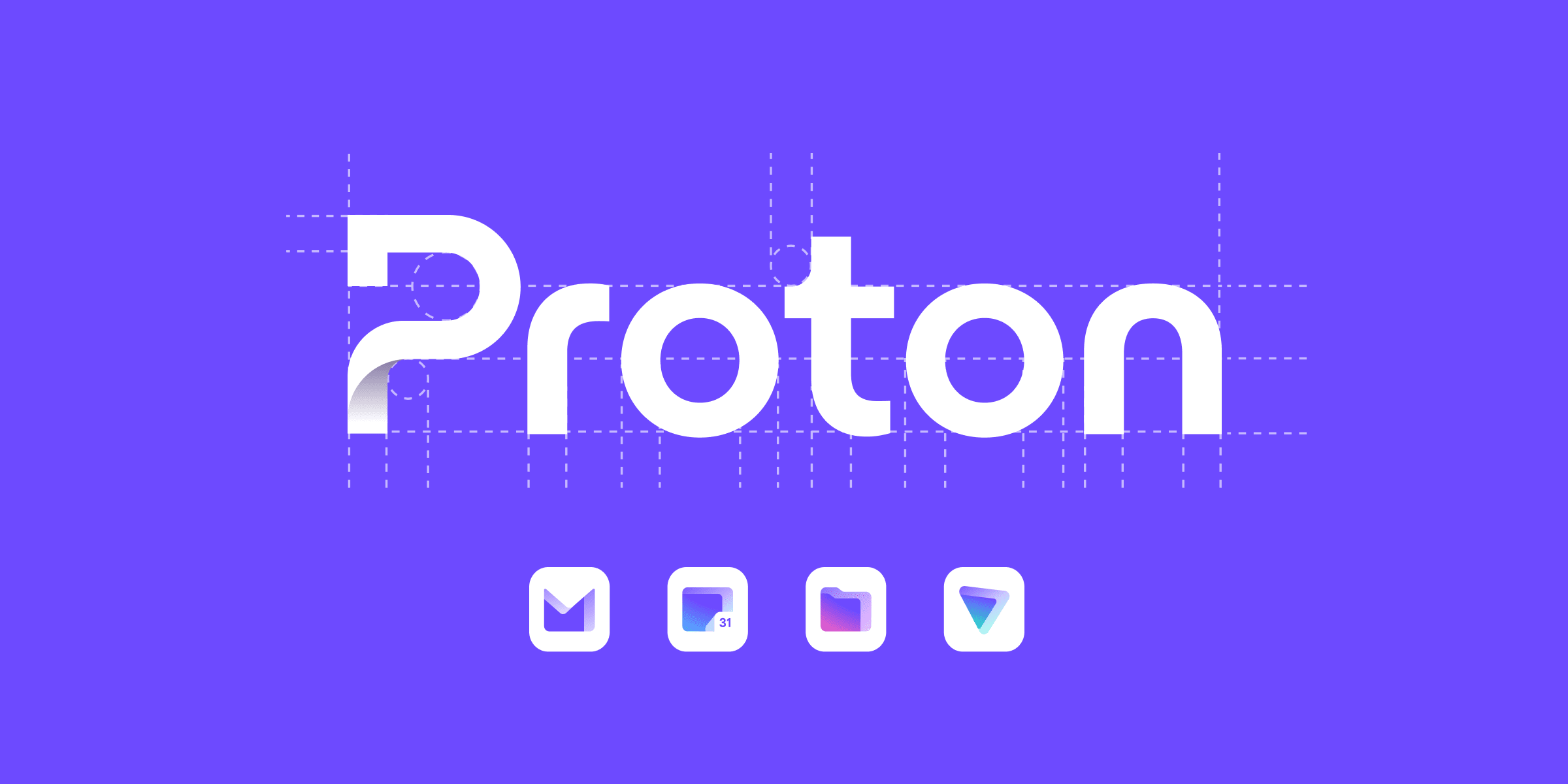
An important part of bringing the Proton product icons together is creating a family resemblance. Each icon must have a similar size, weight, and design, which wasn’t possible with our former icons. We have also retained some elements from our former icons to keep a historical link. Proton VPN’s icon keeps its triangular shape, the corners of which originally represented the three countries that house Proton VPN’s Secure Core servers when viewed on a map. Similarly, Proton Mail’s new icon is based on the bottom half of the original Proton Mail padlock.
We have also worked to achieve a family resemblance through the consistent use of Proton purple, which represents our privacy-focused universe. However, historically Proton products also had their own individual characteristics. For example, Proton VPN is well-known for its green color. For this reason, we have kept subtle accent colors for each product, reflecting that they also have individual identities, audiences, and communities.
A new Proton logo
Proton has always been well-known for our products. However, as the number of products we offer has grown, a strong notion of “Proton” has developed within our community. Thus, it is time that we give Proton itself a visual representation.

Guiding us here is Proton’s mission of building a better internet where privacy is the default. Proton represents a better alternative to Big Tech. If you choose Proton, you are turning away from the path that has been laid out for you and boldly going in a different, better direction. The Proton “P” also has depth and dimensionality that alludes to the depth in the Proton product logos.
Also guiding us is history, with encryption being the past, present, and future foundation of Proton services. The new Proton icon also alludes to encryption keys, which are part of the foundation for all our products.
A new product name construction
Together with the introduction of the new icons and logos for Proton and our products, we are also updating how we write the names of our products. Historically, we have written ProtonMail, but with the expansion of the Proton ecosystem to more and more services, it will now be written as Proton Mail.
This change is necessary to bring consistency between all our services. Historically, Proton Calendar and Proton Drive were written as two words, while ProtonMail and ProtonVPN were one word. Moving to a two-word construction for all our products allows us to remain consistent as we introduce future products and aligns with our shift away from individual Proton products and toward Proton as a unified privacy ecosystem. This change reflects the one that has already begun within the Proton community.
Our color universe
The base color of Proton’s new visual system is a new Proton purple. Purple has historically been Proton’s color. When we launched the first version of Proton Mail in 2014, we used a darker, muted purple that has evolved throughout the years. Today, we are returning to our roots but updating our purple to be bolder and compatible with light and dark backgrounds.
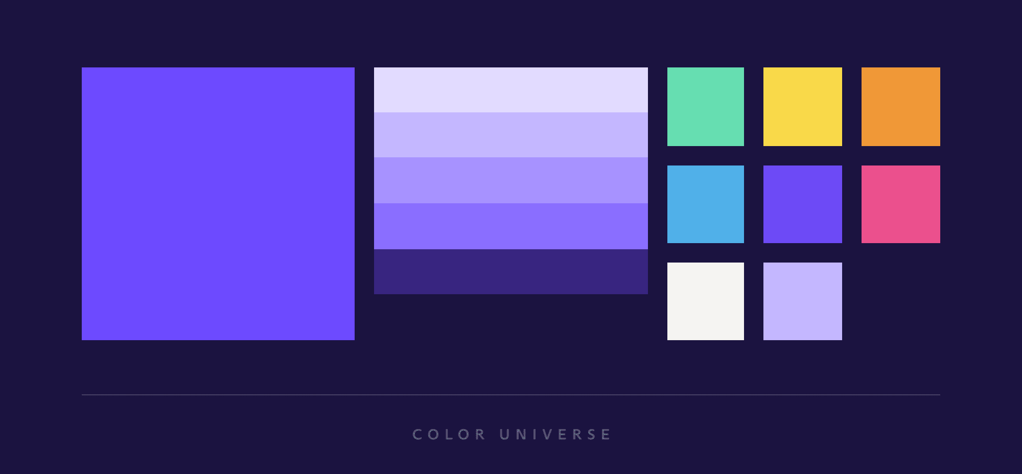
In addition to the new brand color and palette, we have introduced colors specific to each service: green for Proton VPN, blue for Proton Calendar, and red for Proton Drive.
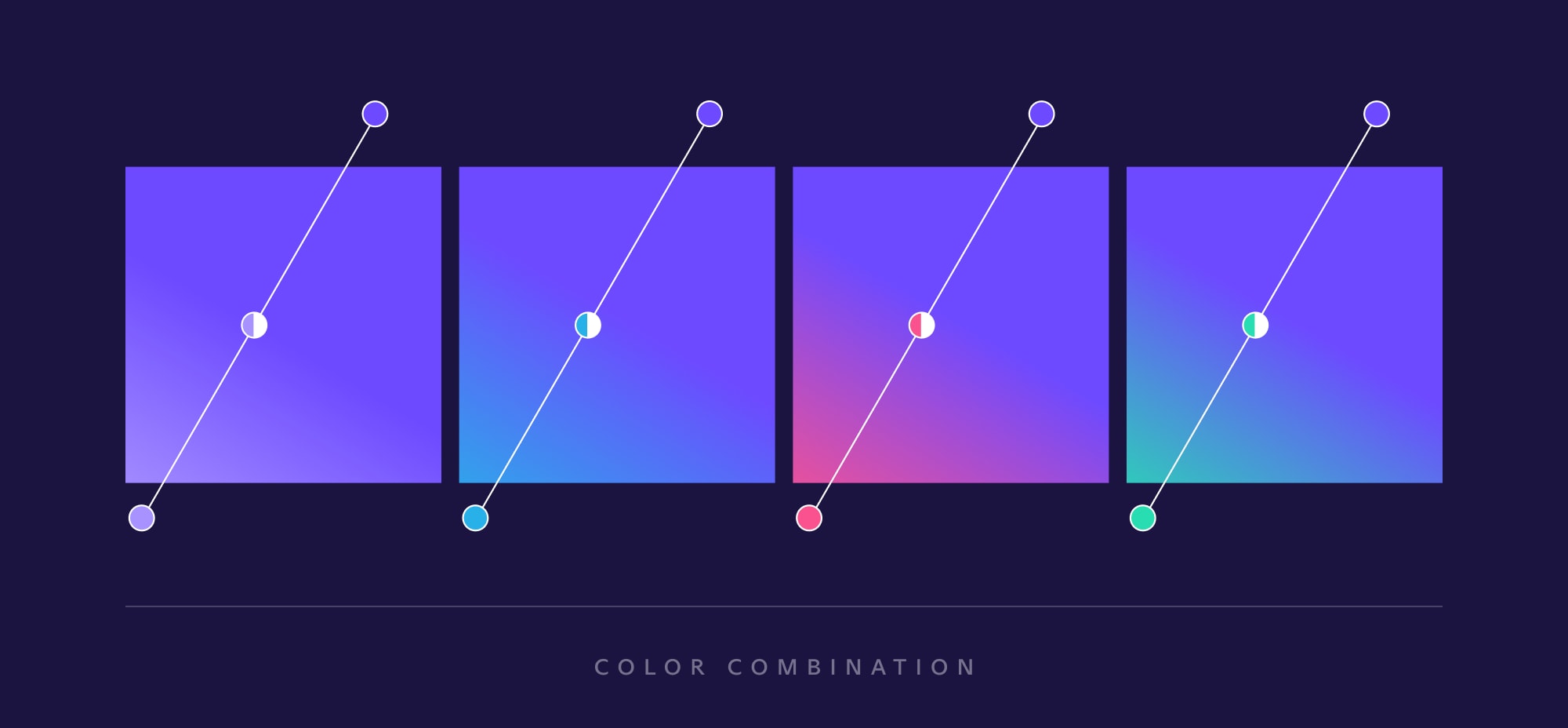
Every icon starts with the Proton purple and then fades into the service color. The aim here is to create an immersive, warm gradient and depth effect that help draw people into the secure, privacy-focused universe created by each service.
Updated typography
Proton has always been a different type of tech company, so we wanted to choose a brand and website font that would also defy the expectations of the tech world, which regularly favors bold, sans serif typography.
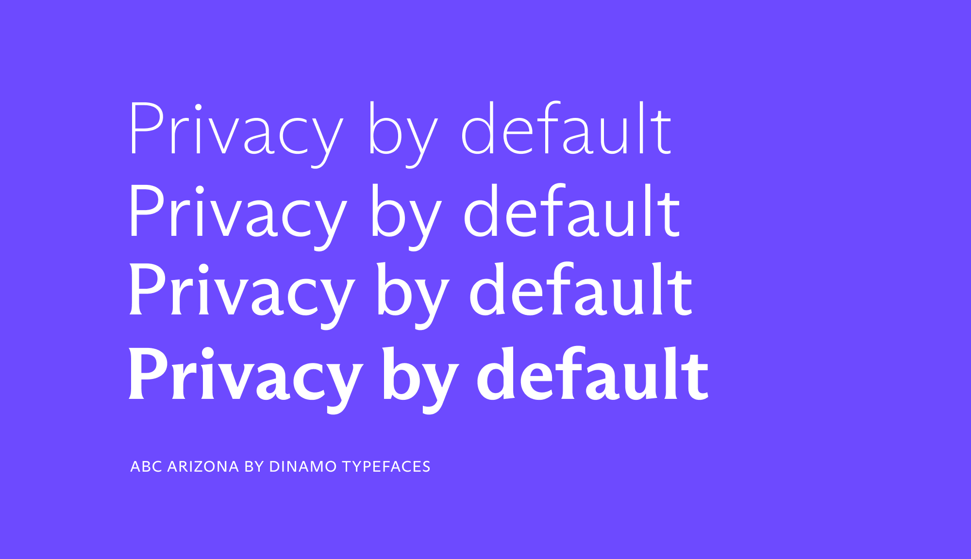
We are building an internet that puts people first, so we felt our font should have a more human touch. A font that can be used to tell stories, a font with empathy and warmth that reflects how Proton is different.
As a Swiss company, we have chosen the ABC Arizona Font designed by Elias Hanzer and produced by Dinamo Typefaces(new window), a Swiss design agency based in Basel. ABC Arizona typography is human, elegant, and adaptable.
It may be a detail, but we believe that this choice of a more humanistic font signals that we prioritize people in our design, our services, and our mission.
We use two styles from the ABC Arizona family on the new Proton website: the Sans and the Flare. All our writing will use Sans, with its straightforward style and humanistic touch, while our headlines will use Flare, a nearly-but-not-quite sans typography that makes a bolder statement.
A new visual identity for a new internet
At Proton, we think of our design as a living thing that, like our ecosystem of services, will never stop evolving. And like everything that we do, its direction will be guided by your input and feedback.
The creation of Proton’s first unified design system is more than a simple visual update. It is a recognition that as the Proton community has expanded, design is as important as technical excellence. An appealing, easy-to-use, simple-to-understand design is essential if we want to make privacy truly accessible to everyone.
Today, we’re excited to take this bold first step. Going forward, we will continue to be innovative and push our boundaries while always putting the Proton community at the center of our design improvements.